Graphic assets tutorial
This tutorial is made for RPG Maker MV, but it's possible that some things work the same for other versions (especially MZ). I won't teach you how to draw or how to use a drawing program, you should know that or investigate on your own. I will explain how every graphic asset works in RPG Maker MV, except sprites, tilesets and battle animations (because I already made tutorials about those).
A lot of the information here was taken from the RPG Maker Help (press F1 with the program open to see it), but it's also based on my experience, since the Help leaves many details out.
Index
- Faces
- Parallax
- Pictures
- Battle
- Title backgrounds
- System
- Balloon
- ButtonSet
- Damage
- Game over
- IconSet
- Loading
- Shadows (Shadow1, Shadow2)
- States
- Weapons (Weapons1, Weapons2, Weapons3)
- Window
- Icon (icon folder)
Faces
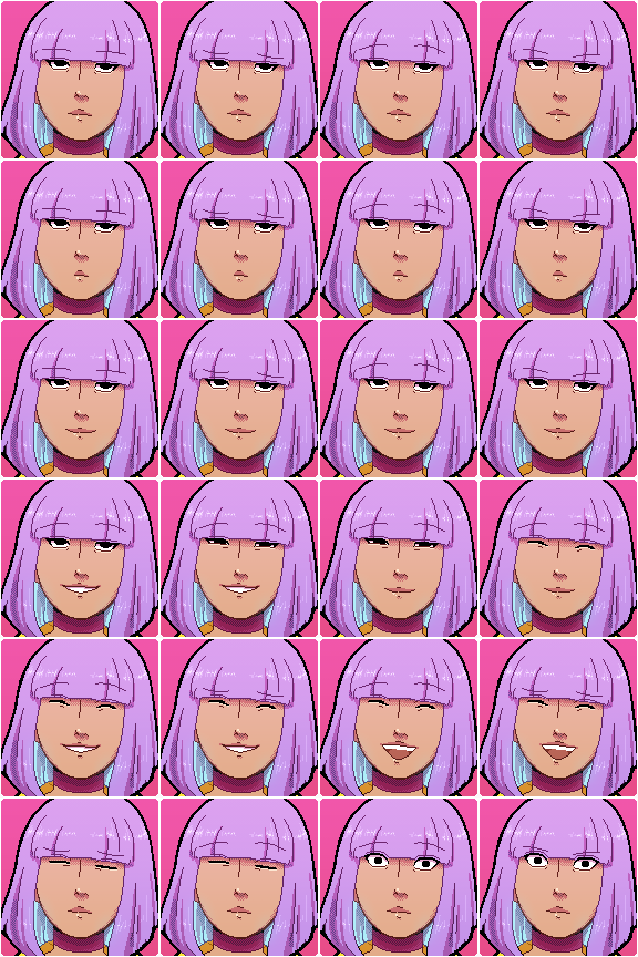
Character portraits that you can find in the faces folder. These images are useed in menus and messages (if you choose to use them). Each face is 144x144 pixels. You can use transparency so they have any shape that isn't a square.
You must organize them on a sheet. Even though the RTP (default assets) only uses 4 columns (576 pixels wide) and 2 rows (288 pixels tall), the truth is you can add as many rows as you want, as long as you keep the 4 column width. I mean, there surely is a limit, but I haven't found it. I advise you to use a sheet per character, or even per character version if they have different outfits, and I assume you won't hit the limit that way.
Parallax
Parallax backgrounds are simply images that are shown on maps under tiles. If A (base) tiles have some transparency, or you leave any tile empty, by default you'll see black under it, but if you have a parallax background you'll see that image.
If this image is smaller than your window, it will repeat itself.
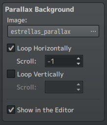
If you check loop horizontally or loop vertically and add a number different from 0, the image will move on its own.
If you add a positive number in loop horizontally, it will move from right to left, and if you add a negative number, it will move from left to right.
If you add a positive number in loop vertically, it will move from bottom to top, and if you add a negative number, it will move from top to bottom.
The further this number is from 0, the faster the image will move.
In general, it's easier to understand how it works if you test it. Any loop checked but with a 0 will make the image not fixed to the window, moving slightly as you walk through the map. And if you don't check it, it will be fixed on the window.
Furthermore, if the .png file starts with "!", the image will be fixed to the map (not to the window), so you can use an image as a map. Does this mean it's advisable to use a parallax image instead of tiles? As I said in the tiles tutorial, I believe it's not. But no one says you can't use this technique from time to time.
This means that... contrary to what I used to believe, you don't need a plugin to do "parallax mapping", since this trick is enough. You would need tiles or events to do anything that isn't the floor, though. But don't let this stop you from investigating what plugins people use, and find out if they're interesting to you or not.
Pictures
Commands
The images inside the pictures folder will be the ones you can use with the command "Show picture". There are other commands related to these images: "Move picture", "Rotate picture", "Tint picture" and "Erase picture". I'll explain how they work.
Pictures can be any size you want, but the most logical thing is for them to be the same size as your window or smaller (unless you plan on moving a very big picture that is seen little by little).
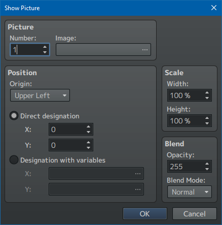
In Number you have to assign a number that will represent the layers. This is useful in case you want to show more pictures: if they have a bigger number than this one they will go above, if they have a smaller number they will go below, and if they have the same number they will replace the older image for a new one. The maximum number is 100, which is more than enough room.
In Image you select the image from the pictures folder.
In Position > Origin, you choose whether the image will be placed with its upper left corner as reference, or the center. Below you can choose the X and Y, using direct designation, or variables that you have set up before and can vary depending on any factors you want.
If the image is as big as your window, using Upper left X0 Y0 is the easiest way. If you want to center your image, it can get complicated: in theory selecting Center and setting the X and Y at half the width and height of your window respectively should work, but some images can get blurry if any of its dimensions is an odd number (or at least that's what I think the problem is). If that happens, you just have to use Upper left, which will force you to use an image editor or art program to find out what X and Y you need to use to center the image.
Scale has the same problem as the frames in battle animations if you choose any size that isn't 100%, it will look blurry, which looks awful if your style is pixel art. I advise not using this option for this reason, simply use your image editor if you need to resize an image.
Blend lets you change the opacity and the blend mode (normal, additive, multiply and screen).
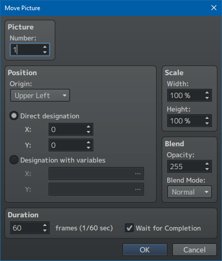
Now let's go to Move picture. Here we select the picture previously shown with Show picure using its Number, and we choose a new Position, Scale or Blend. In Duration we choose how long it takes in frames (if we enter 1 it will be instant) and whether we want the event to wait until this movement is finished or not before it keeps going with the other commands.
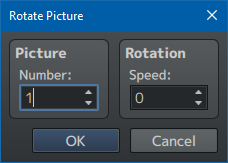
Rotate picture has significantly fewer options. We choose the picture by Number and, in Speed, if we put a positive number it will rotate clockwise, and if we put a negative number it will rotate counter-clockwise. If we put 0, it will stop rotating, staying in its current position, not the original. Again, this one has the same problem as Scale: pixel art will look blurry and bad.
Besides, if the picture was shown selecting Upper left instead of Center, the rotation axis will be that point on the upper left, which could be inconvenient in many cases.
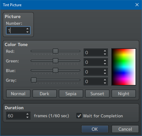
Tint picture works basically the same as Tint screen. You choose the picture by Number and you can change the color tones with those sliders, optinally making this change gradual if you choose a Duration.
And last, Erase picture, which does what you think. Pictures, once shown, won't go away from the screen until you use the Erase picture command, even if you change maps, so have that in mind. They only stop being on top of everything when you open the menu or go to battle, but when you get back to the map they'll be where you left them.
Another thing to have in mind: images go under message windows. If you need an image to be on top of message windows, you'll need a plugin (but honestly, I can't think of many cases where someone could want this).
Animations using show picture
RPG Maker MV doesn't have a "show images as animation" function (sadly), but we can do it manually. We only need to Show image in a specific number, add a "Wait" command as long as we need to, and then again Show image, using the same number as the previous image, in succession, until we show all the images in our animation.
Having in mind there are 60 frames in a second, we can calculate how long our waits need to be. For example, in my game I show all my images with a 8 frame wait between each image, so it's close to a 8 frames per second speed. If you draw your animations (out of RPG Maker) at 12 fps, each wait should be 60 / 12 = 5 frames. If you draw at 24 fps, 60 / 24 = 2.5 frames (however decimals aren't allowed, so you'll have to choose between 2 or 3).
This method works, but it's a little tedious to use, so I don't recommend it if you have a super long sequence of, I don't know, 50 images. It gets to a point where it's easier to play a video, your patience limits are up to you.
There's also a problem that you'll notice if you try this method: when you show several images in a row, you will notice an annoying flicker. Also, if you run this event twice, it will only happen the first time, from the second time on it will play smoothly.
This happens because images need to be pre-loaded. With a single image you won't notice that it takes a moment to load, but when there are several of them you will. To pre-load images, you can use a plugin, but I honestly have tried a couple and didn't like them much, so I just use a simple script call:
ImageManager.reservePicture("filename")
Add this as a script call for each image file you need to show. Don't add .png to the filename, and don't forget the quotations. After that, you should either add a one frame wait, or use this script before another event command that you're using so it's not right before Show image: for example, I pre-load the images, I show a dialogue, and then I show the images.
This way, images will be already loaded and they won't lag. Be careful, though, because if the game gets closed between one action and the next, they will not be pre-loaded when you open it again. That's why I always pre-load the images in the same event that will show them, not letting the player save the game between each.
By the way, if this ever happens to you with any other image (sprites, tilesets...), there are script calls for all of them. You can find them in js > rpg_managers.js.
ImageManager.reserveCharacter(), ImageManager.reserveFace(), ImageManager.reserveTileset()... I won't copy all of them here, it's easier if you go check it out.
Message window using show picture
If you don't like how message windows look when using Window.png as a base, which I explain later, and you want to use a specific image instead, I'm sure there are other plugins that let you do it easier than what I'm going to explain. But if you just want to do it a couple times for special moments (I use it for phone messages, for example), you can do it manually.
If we simply show an image and after that we added a message with a transparent background, it will work, but this message will always appear a moment after, not at the same time. This happens because message windows, when one appears for the first time, make an opening animation. This happens even when you can't see them because they're transparent. And of course, the animation takes a little time to finish.
If you want them to appear at the same time, you just need to do this:
- Add a message with a transparent window that only has this code: \^
- Show picture
- Add the actual message with a transparent window
The code simply makes it advance to the next message automatically, so it plays that first time animation (while invisible) and that way you make it possible for the image and the next message to appear at the same time.
Battle
Enemies
There are two folders where enemy images are stored, enemies and sv_enemies. The former is for Front view, and the latter is for Side view, which you can choose in Database > System > Options. Side view will show your actors attacking*, not just your enemies. In the RTP the two folders seem to have the same files, but if you look closely, you'll notice that images in sv_enemies are a little smaller. There is no fixed size for enemies, they work the same as pictures in that regard.
If you make your own graphics (I guess you do, since you're looking at this guide), you only need to fill one of the two folders, depending on which mode you're using. I'm gonna give you an advice which I already included in my battle animation tutorial: make sure your image's dimensions are even numbers, or skill animations could look blurry.
Another advice: by default, in order to place enemies on the screen in their Troop (in Database), you can move them around with your mouse on the preview, or you can press the align button. But if you want to set the X and Y using numbers because you prefer that, or if you have a window of a different size from default, you can't place them accurately. I recommend this plugin: EnemyPlacement by LadyBaskerville.
*Another thing I want to mention here, about Side view. Sometimes us solo devs have to compromise and try to not make assets like we're a full team, so we'll want to cut corners and not include things like actor animations. Another reason could be avoiding the inconsistency of actors being animated while enemies are not unless you use a plugin (and again, animating everything takes a lot of time and effort). That's why it's pretty common to prefer Front view, and that's what I do in my game as well.
But Front view has its issues: for starters, enemies won't show any animation when they attack (the ones that you create in Database > Animations). Instead, when they attack, the screen will "shake". This is something I didn't want for my game. It also has another inconvenient that I will explain in the Battlebacks section.
There are some solutions. You can use a plugin that shows enemy animations in Front view (I think there's a Yanfly that does it, but I didn't like it because it also adds a bunch of other stuff I didn't want and I couldn't turn off). But I found another way that also needs plugins but it's more direct and you have more control over what you're changing:
Using a simulated Front view. In Database > System, you check Side view, and you assign no image to your actors (or you select a transparent image) in "[SV] Battler". Now they will be invisible, and animations from enemy skills will play. It's also important to go to the system folder and change the images Shadow2, Weapons1, Weapons2 and Weapons3 so they're transparent (but don't delete them). Since by default battlers are on the right side of the screen, you'll need a plugin to move them around, and you have one in your RPG Maker folder (the program itself) > dlc > KadokawaPlugins, it's called SVActorPosition.
If you also use another plugin to change your battle UI (I use SRD_BattleStatusCustomizer) so that actor faces appear, with SVActorPosition you can place these invisible battlers so that they match this new menu, and now animations will play near each face. You also will probably need to avoid that little movement they make forward and backwards when they attack or are attacked, and for that you can use my plugin BF_cosas.
I understand this is quite a bit of setting up. Otherwise, if you don't want to do it like in my game (you don't want a battle UI with faces, for example), you can make all enemy animations have a "screen" position, so that they don't target any of your transparent battlers, and so it doesn't matter where you place them.
Battlers
That said, and unrelated to my opinion on the matter, you can use battlers if you want. Unless you use a plugin to manipulate them differently, sheets need a specific proportion, though not a specific size, similarly to sprites. I'll use an RTP battler as an example.
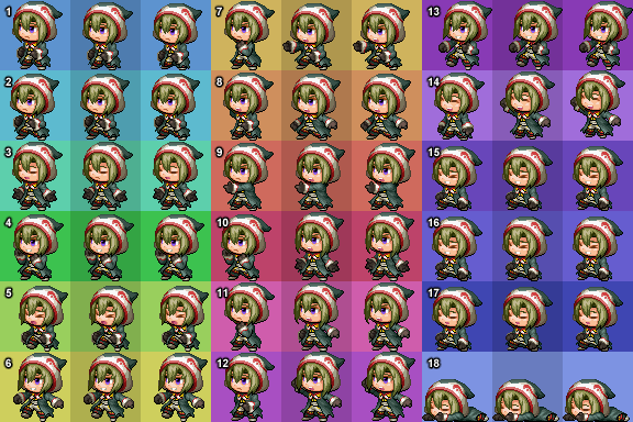
I added colors at the background to explain myself better, but normally it would be transparent.
There are 18 different animations, each 3 frames long. They are organized in 3 columns and 6 rows. In the RTP, each frame has a size of 64x64, and the whole sheet is 576x384, but the important thing is that every frame is the same size and the sheet is organized in the correct number of columns and rows.
Now I'll explain when each animation plays (this information is taken from the Help, I don't have real experience with this, so I advise you to test it).
- 1: Step forward (when they're doing nothing, before you select commands)
- 2: Normal standby (when they're waiting for their turn after you select a command)
- 3: Chanting standby (same as before, but they're gonna do a magical attack when their turn comes)
- 4: Guard
- 5: Damage
- 6: Evade
- 7: Thrust (animation for certain weapons: bare hands, claw, glove, spear)
- 8: Swing (animation for certain weapons: dagger, sword, flail, axe, whip, cane)
- 9: Missile (animation for certain weapons: bow, crossbow, gun)
These three animations can be assigned differently in System > [SV] Attack motions, in case you add other weapon types. And they are always used in normal attacks when actors wear those weapons, but not for skills.
- 10: General skill
- 11: Magic
- 12: Item
- 13: Escape (if it's successful, they will also slide to the right)
- 14: Victory
- 15: Near death
- 16: Status ailment
- 17: Sleep
- 18: Dead
Some movements will only play once, frames from left to right in order 1-2-3 (animations 5, 6, 7, 8, 9, 10, 11, 12). Others will play on loop, frames in order 1-2-3-2 (animations 1, 2, 3, 4, 13, 14, 15, 16, 17, 18). I couldn't check all of them and the Help doesn't specify most of them, but I think that's how they work.
About weapons that go with 7, 8 and 9, I will explain them in their own section (the system folder).
As you can see, battlers are quite limited. There is no way to add more than 3 frames, nor choose their speed, nor choose more freely when each is played (other than moving around animations on the sheet). If you want something more intrincate, you'll need to find a plugin. Or, if you want to save time and effort, you can simply not use battlers.
Battlebacks
There are two battleback folders: battlebacks1 and battlebacks 2. In the RTP, this is convenient because the battleback1 will go in one layer and the battleback2 will go in a different layer above 1, which lets you combine images and have a wider variety of backgrounds. But if you're going to draw your own backgrounds, it's easier to just make them the same size as your window and place them on battlebacks1.
In the RTP, battlebacks are bigger than the default window (they're 1000x740, meanwhile the window is 816x624), since they're meant to also work for Front view, and when the screen shakes after enemy attacks, some portions that were hidden will be seen.
Another thing to have in mind and another reason I don't recommend Front view is that, if you draw your images the exact same size as your window, in Front view they will be shifted upwards a little (and repeated), so on the bottom part you will see a strip of what you should be seeing at the top.
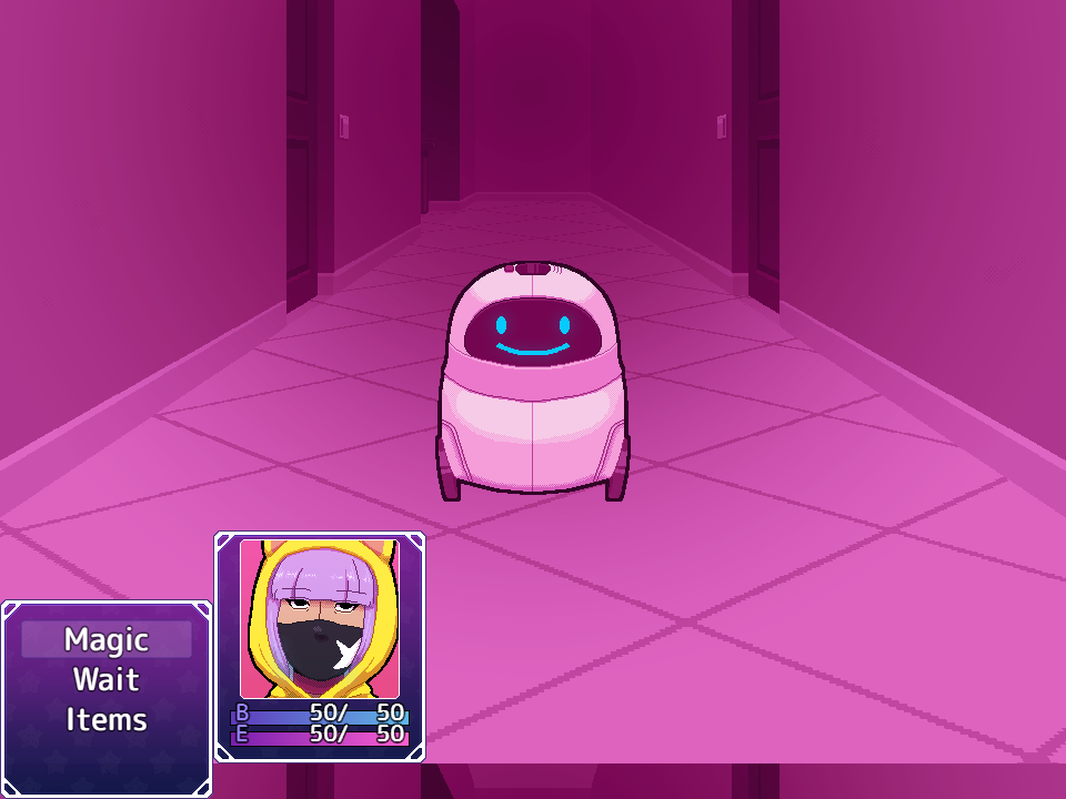
In my case, it would be 32 pixels, but I've seen other games' cases where it's a different number (it probably depends on window size). So you should check your specific case and draw your battleback having this in mind... (or just use Side view because this doesn't happen, lol).
Title backgrounds
Similarly to battlebacks, title backgrounds come in two folders that you can use as two layers: titles 1 and titles2. But again, if you're drawing your own backgrounds, it's easier to just use one of the folders. You choose them in System > Title Screen > Images.
There's also an option to add your game title as text (Draw game title), but it's easier to add it to your image yourself, which lets you choose your font or use a logo.
If you want to change how title images work in order to add more layers with independent animations, you'll have to use a plugin. I recommend MOG_TitleLayers, which I use for layers (it lets you use up to 10), since I wanted to make one of them move diagonally. You can also show frame animations using several images, not just automatic movement.
If you want to change position of the little window on the title screen (New game, Continue, Options), you can use this plugin from the dlc folder > KadokawaPlugins called TitleCommandPosition. But if you want something more complex (adding commands, changing what the window looks like), you'll need something else. I can't recommend anything for this, I made my own, and it's tailored to my game.
System
Images from the system folder. There are many things here that can be a little complex, but you will see that I tend to recommend to ignore what RPG Maker intends you to use.
Balloon
These are the animations that will play above your characters' sprites (player or event) when using the "Show balloon icon" command. Each frame is 48x48 pixels, and each animation is 8 frames, each of them occupying a row, with a total of 15 available animations, making the sheet 384x720 pixels. The speed animation can't be controlled without a plugin.
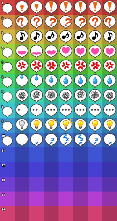
I added colors to the background so you can tell the zones apart, but normally they would be transparent. Animations are selected in the engine by name:
- 1: Exclamation
- 2: Question
- 3: Music note
- 4: Heart
- 5: Anger
- 6: Sweat
- 7: Cobweb
- 8: Silence
- 9: Light bulb
- 10: Zzz
- 11 - 15: User-defined 1-5
From 11 to 15 there is blank space on the sheet so you can add whatever you want. Of course, nothing is stopping you from replacing any of the first 10 ones for a different emotion if you don't have an use for some of them.
I don't know any plugin that adds total flexibility for balloons (choosing a different number of frames for every animation, speed...), but it's possible one exists that works for you. In my case, if I ever needed to use any balloon animation, I'd simply use events. Because I use QSprite to animate sprites in a completely custom way, I just need to create an event, make it visible, place it next to my character, and play the animation I need.
That said, the game will crash if it doesn't find some images from the system folder, and I'm not sure which ones are safe to delete. So, just in case, I recommend to leave them as they are or replace them with a transparent png if they're in the way.
ButtonSet
Buttons for Android exports or when using the mouse, that appear in shop menus when selecting quantities and when you let the player enter a variable (Input Number command). This is all the information that appears in the Help, everything else I had to test myself.

Again, I put colors in the background, but normally it would be transparent.
The image needs to be 288x96 pixels. It has 2 rows and 6 columns: each button is 48x48 except the accept button, which is 96x48 (taking up 2 columns). The top row is how they normally look, and the bottom row is how they look when you click on them (by default they're smaller and more transparent, but you can do whatever you want). The button order is: decrease 10, decrease 1, increase 1, increase 10, and accept. They all appear in shops, but in Input Number the 10 ones aren't there.
If you want to see where exactly they appear in shops and in Input Number, it's better if you see for yourself. This asset isn't very flexible, so if you want to change their placement or something you'll have to use a plugin.
By the way: by default the ButtonSet has an error, some corners in its solid buttons have some transparent parts where they shouldn't, you can tell if your background is dark. If you're gonna use the default ones, you should fix this.
Damage
In battles, when enemies or actors receive or heal damage, numbers will appear to reflect the quantity. Instead of using the font that is used throughout the game, RPG Maker uses this image. If your game's font is too different to the one by default, you probably will want to create your own Damage.png.
Each number, by default, takes up a space that is 24 pixels wide and 32 pixels tall. They start with 0 and end with 9. And they are organized in 5 rows, making a total size of 240x160. However, if you follow the proportions, the sheet can be any size.
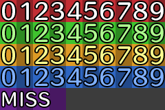
Each rows does this:
- 1: (Red) HP damage. By default, numbers are white.
- 2: (Green) HP recovery. By default, numbers are green.
- 3: (Orange) MP damage. By default, numbers are yellow.
- 4: (Blue) MP recovery. By default, numbers are blue.
- 5: (Purple) The message for when an attack fails (both for missed attacks and evaded attacks). It's aligned left because this message can only occupy 4 blocks starting from the left, if you add something else to the right it won't show up.
Game over
The GameOver.png image is what you're thinking. It gets placed from the upper left corner, so if your game has a different window size from default, you'll need to use an image of that size.
That said, games don't always need to show the GameOver screen. With the "Game over" command you will show this image (and the music selected in Database > System > Music > Game over will play), but when your game ends you can simply show whatever else you want to show with other commands and then use "Return to title screen".
It's true that the Game Over screen appears when you lose battles, but you can avoid this if, in battles started by events ("Battle processing"), you check "Can lose". There you can add a scene with event commands and then "Return to title screen".
This works for me because my game has no random battles that appear while walking on the maps. If you do use them, it's possible there is a plugin to change what happens when you lose battles, but I don't know enough about this to recommend one.
Or you can use a regular Game Over screen if you want! I simply think that controlling it with events is more flexible, letting you, for example, show an animation, or let the player choose if they're gonna go to the title screen or load a save. You can even make them go back to a "checkpoint" without needing a save.
IconSet
Icons that are used in many places: skills, items, weapons, armor, states, messages if you use the codes for them, or some plugins.
The size of each icon is 32x32, and by default they're organized in 16 columns and 20 rows, making a total of 512x640 pixels. Just like with faces, the 16 columns are fixed and if you add more of them you won't be able to select those icons to the right, but you can add or delete as many rows as you want.
And, if you don't want to think too hard about it, you can always draw on top of the default sheet, which has space for 320 icons, more than enough for most games. It's important that you leave at least a blank space for when you want an invisible state.
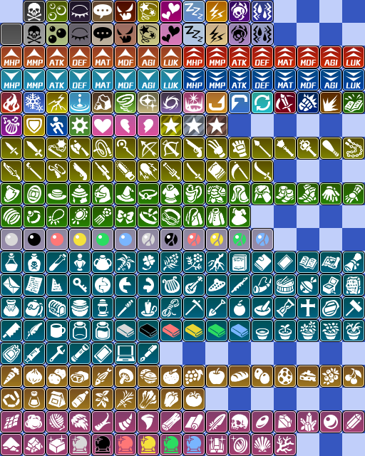
By the way, maybe you haven't noticed, because the RTP icons have a little anti-aliasing, but sometimes these icons show up blurry even if they're perfectly placed on their sheet. This is a problem in the base code of RPG Maker that I only noticed when I made my pixel art icons. I included this fix in my plugin BF_menu, but because it's very tailored to my game, it won't work for most people. So I'll give you the relevant code I used to fix only this:
Window_Base.prototype.processDrawIcon = function(iconIndex, textState) {
textState.x = parseInt(textState.x)
this.drawIcon(iconIndex, textState.x + 2, textState.y + 2);
textState.x += Window_Base._iconWidth + 4;
};
If you copy this to a .js file and turn it on as a plugin, the icons won't show up blurry anymore.
Loading
This image in the RTP is smaller than the window, but because it gets centered and has a black background, it looks like it takes the whole window if no map has loaded yet. It's possible that you've never seen it because RPG Maker games usually load very fast, so you have no way to test it unless it's about to crash.
My advice is to make it the same size as the window, that way there's no risk of it looking bad if something else is under it. Or you can make it have a transparent background, to avoid the black rectangle.
In my case, being one of the few images that are incompatible with the translation plugin I use (which is otherwise fantastic), instead of showing "Now Loading" I prefer to use an icon.
Shadows (Shadow1, Shadow2)
Shadow1 is used under the airship, and Shadow2 is used under the battlers.
In my case, I don't use any vehicles, and my battlers are invisible, so none of these images are of any use to me. Shadow1 can stay as it is, but Shadow2 I have to edit so it's a transparent png. In my opinion, even if I wanted to use either vehicles or battlers, it'd be easier to add this shadow as part of the sprite or battler, which is what happens with enemy graphics.
States
In this sheet you will find the animations for status ailments for allies in Side view. Each animation frame is 96x96, and each animation has a total of 8 frames, organized from left to right. With an animation per row, it has 8 columns and 10 rows, making it a total of 768x960 pixels.
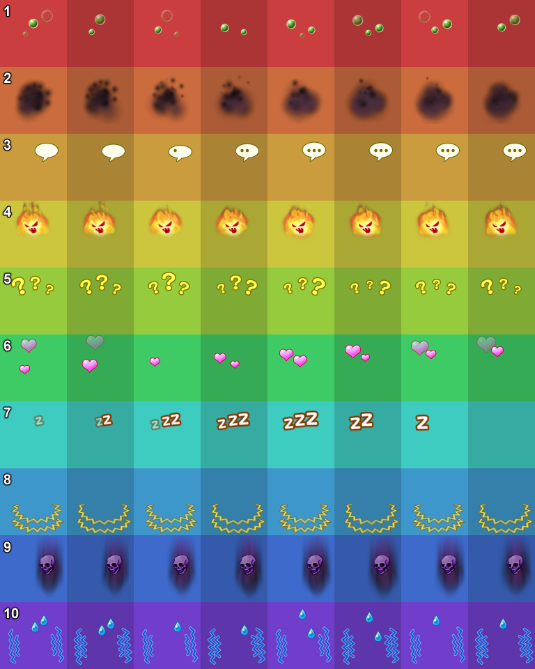
Even though you can choose any animation for any state, or place any drawings you want wherever you want, the names are hardcoded, and they go like this:
- 1: Poison
- 2: Blind
- 3: Silence
- 4: Rage
- 5: Confusion
- 6: Fascination
- 7: Sleep
- 8: Paralyze
- 9: Curse
- 10: Fear
There's no room for more, and you can't control the speed, nor the number of frames, nor the size. Besides, they won't show on enemies, only on allies. For this reason, many games choose to not use this system at all.
At the time of writing this tutorial, I still don't have that much experience on this topic because on chapter 1 of my game there are no status ailments, but I've been testing this VE_LoopAnimation plugin and it's already quite better: instead of this sheet, you can use animations that you've created yourself in Database > Animations.
Furthermore, the HIME_StateChangeAnimations plugin lets you show animations when this state is applied and removed, also using animations from the Database. A lot more flexible than the sheet.
Weapons (Weapons1, Weapons2, Weapons3)
As I already said in the battlers section, weapon animations go together with the Thrust, Swing and Missile animations.
Each animation has 3 frames, each frame is 96x64. Weapons1 and Weapons2 sheets are organized in 6 columns and 6 rows: in each row, the left half is one weapon and the right half is another weapon, making a total of 12 weapons. In total, sheets have a size of 576x384 pixels.
Weapons3 is organized in only 3 columns, making a total of 6 weapons. In total, this sheet has a size of 288x384 pixels.
As opposed to the battler sheets, which work at any size as long as you follow the proportions, weapons have a fixed size... which makes them incompatible with battlers if they're not the same size as the RTP... I also think it's absurd, yes.
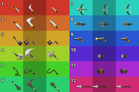
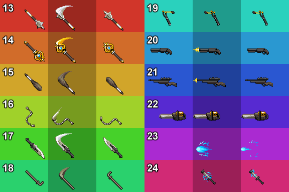
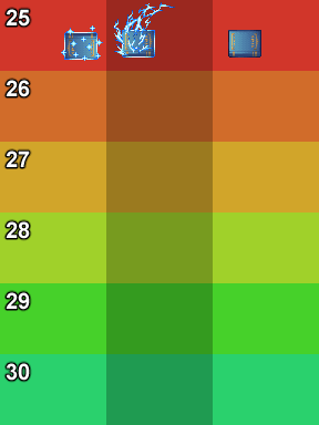
The first frame of each animation shows up when the attack is preparing, the second when the attack happens, and the third when the action is over. They always go under the battler.
Even though you can use any drawing wherever you want, weapons have hardcoded names that are used in the Database in order to assign these animations to each weapon type. These are:
- 1: Dagger
- 2: Sword
- 3: Flail
- 4: Axe
- 5: Whip
- 6: Cane
- 7: Bow
- 8: Crossbow
- 9: Gun
- 10: Claw
- 11: Glove
- 12: Spear
- 13: Mace
- 14: Rod
- 15: Club
- 16: Combat Chain
- 17: Futuristic Sword
- 18: Iron pipe
- 19: Slingshot
- 20: Shotgun
- 21: Rifle
- 22: Chainsaw
- 23: Railgun
- 24: Stunrod
- 25-30: User-defined 1-5
As you can see, this system is very limited, even more than the battlers. If you use battlers, I would advise using a plugin that lets you use these sheets in a different way (though I don't know of any), or simply include the weapons on your battler sheets. Though in that case you'll have to look for a way to change the sheet depending on the weapon the actor is using.
Even if you have no use for these images, you must leave them in the folder. If you don't want them to be visible, you can unlink the animations from the weapon types in the Database, or make sure that no weapon has an assigned animation, or make the image transparent.
Window
The appearance of your windows inside your game is determined by the Window.png image. It's one of the things that are customized the most, so it's possible you've already seen templates around. In any case, have this one:
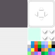
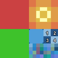
It's a 192x192 image divided in 4 96x96 squares.
The red zone (upper left corner) is your window's background. It will get stretched depending on window size, so it's not advisable to draw patterns or drawings here. Normally a flat color or a gradient is used here. You can use opaque or translucent colors.
The green zone (lower left corner) is the texture that will be applied on your window background. As opposed to the background, instead of stretching this one will repeat, so you can add drawings here, but you have to make sure they tile well. If you don't want any texture, just leave this part transparent.
The yellow zone (upper right corner) is for borders and non animated arrows in menus (the ones for long menus, like save and load).
About borders, their corners will stay as they are, but the border part that connects the corners will get stretched. So, it's a good idea to draw them in a way that looks good even if stretched. Each corner has a non-stretched zone of 23x23 pixels, and each border has a 50x23 (or 23x50) zone. Though it's a good idea to make them thinner than 23 pixels, since some text will go on top of this zone in menus and messages.
The arrows are shown as you can see them here. The maximum zone is 24x12 (or 12x24), anything drawn outside won't show or will be stretched together with the borders. Funnily, the side arrows aren't used in the base game anywhere, but it's possible for plugins to use them.
The blue zone (lower right corner) is divided in three parts: the cursor, the animated arrows (for messages) and the color palette. Both the cursor and arrow zone are 48x48, meanwhile the color palette is 96x48.
The cursor is that rectangle that will appear to let you select options, which by default has a blinking animation (which I turned off with my plugin BF_cosas). Similarly to borders, it has a part that won't stretch (the corners) and a part that will (the rest), so have it in mind. The parts that won't stretch are 3x3 pixels on each corner.
The animated arrows are divided in 4 24x24 squares, each being an animation frame. The animation order is 1-2-3-4 on loop. By default this animation is an arrow moving up and down, but you can draw any movement, it doesn't need to be an arrow.
The color palette contains 32 12x12 squares organized in 8 columns and 4 rows. Since the image is quite small, I'll show you an enlarged version with numbers assigned so I can explain what each color is used for (it starts counting from 0).
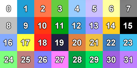
- 0: Default text
- 1-15: Not used in the game, you can reserve them for text codes (explained below) or for plugins
- 16: For text in menus like HP, MP, Lv, stat names, equipment slot names...
- 17: When your allies are below 25% HP, their name is written in this color
- 18: When your allies are dead, their name is written in this color
- 19: Background color for bars (HP, MP, TP...), which is visible when bars aren't full
- 20-21: With these two colors a gradient is made for the HP bar (20 to the left, 21 to the right)
- 22-23: With these two colors a gradient is made for the MP bar (22 to the left, 23 to the right). Besides, the MP cost for skills is written in color 23
- 24: When you change equipment, this color will show if a stat is gonna raise
- 25: When you change equipment, this color will show if a stat is gonna decrease
- 26: Not used
- 27: Not used
- 28-29: With these two colors a gradient is made for the TP bar (28 to the left, 29 to the right). Besides, the TP cost for skills is written in color 29
- 30: Not used
- 31: Not used
These are the numbers assigned to each color inside the game code, so for example, in messages you can type \c[number] and the text will be written in the assigned color.
By the way, as far as I know, the engine takes just one pixel from each of these squares (I don't know which one, but if I'd have to guess it'd be the upper left one), so making a gradient in one of these squares won't do anything.
Icon (icon folder)
The last image we can customize isn't in the img folder, we'll have to go before that, to the icon folder. Here we can find a png of 128x128 size, which will be used as game icon, but we'll soon notice that it's not used everywhere we would expect.
If we edit icon.png and open playtest, we'll see that it only shows up in the taskbar (in Windows, which is the one I use. I have no idea what happens in Linux or Mac). In the window itself the default icon will appear, and if we export the game we'll notice that the exe (Game.exe) also has the default icon. Each of these cases has a different solution.
Executable icon
In order to change the executable icon (Game.exe that will appear after exporting the game), we'll need to download a free program called Resource Hacker.
Once we have it open, we have to drag the exe inside this program, and open the Icon folder on the left menu. We choose the last one (4), and we will see on the preview that one default image from the icon folder. After that, we click on Action > Replace icon, and we look for the image we want to use... but it has to be in .ico format.
There are surely many tools to convert a png image into an ico, but I use this one because it makes pixel art not blurry when it resizes. In your icon folder inside your project you should have a png, but you should also convert this image into ico and save it somewhere else so you can edit the exe.
If you didn't know, the Game.exe file is the same for every RPG Maker MV game (what changes between them is the data, images, sounds...). This means that if you have edited one of these exes to change their icon, and you export a new version of your game, you don't need to follow these steps each time. You can replace the exe for an old one, no problem.
Window icon
This is an even simpler solution. In your project there is a file called "index.html". Open it with a coding program like Visual Studio Code or Notepad++, though you can also use the normal Notepad.
Go to line 8, where it says:
<link rel="icon" href="icon/icon.png" type="image/png">
Add "?2" after "icon.png", like this:
<link rel="icon" href="icon/icon.png?2" type="image/png">
Now your customized icon should work on the window. It's possible that it won't appear on playtest, but it will when exported.
NW.js profile error
This has nothing to do with the icon, but since we're here I'll tell you another easy fix. When you open an RPG Maker MV game it's very common for a popup to appear, which says "Profile error occurred". In fact this is not a real problem, you can ignore it safely, but if you don't like it to appear all the time, you can avoid it.
There are two files in your exported game called "package.json", one outside of the "www" folder and one inside. I'm pretty sure you need to edit the one outside (but there's no harm in editing both). Open it with a coding program like Visual Studio Code or Notepad++, though you can also use the normal Notepad.
Here, in the second line, you must type anything after "name", in quotations. For
example:
"name": "name",
And with this, the popup should stop appearing. However, if many games have the same thing written here, there could be compatibility issues. So it's better if you enter the name of your game or something that you believe won't be shared by any other game. And just in case, don't use special characters.
And that's it for the graphic assets tutorial. If I learn something new, I may add it. It's also possible that I made a mistake somewhere, in which case please tell me. But I hope it was helpful. And if you want to thank me... you can always donate, or play my game, which is free.