Tileset tutorial
This tutorial is made for RPG Maker MV, but it's very possible that it works similarly in other versions. I won't teach you how to draw or how to use a drawing program, you should know that or investigate on your own. I will explain how tiles work in the engine and some tips in general.
Warning: I don't explain autotiles in detail, because I don't use them.
Index
- Database basics
- Tileset characteristics
- Tip: where to start
- Tip: avoiding blocky tiles
- Tip: parallax mapping
Database basics
Before you start drawing tiles, you need to understand what the Database does with them. Feel free to skip this part if you already know.
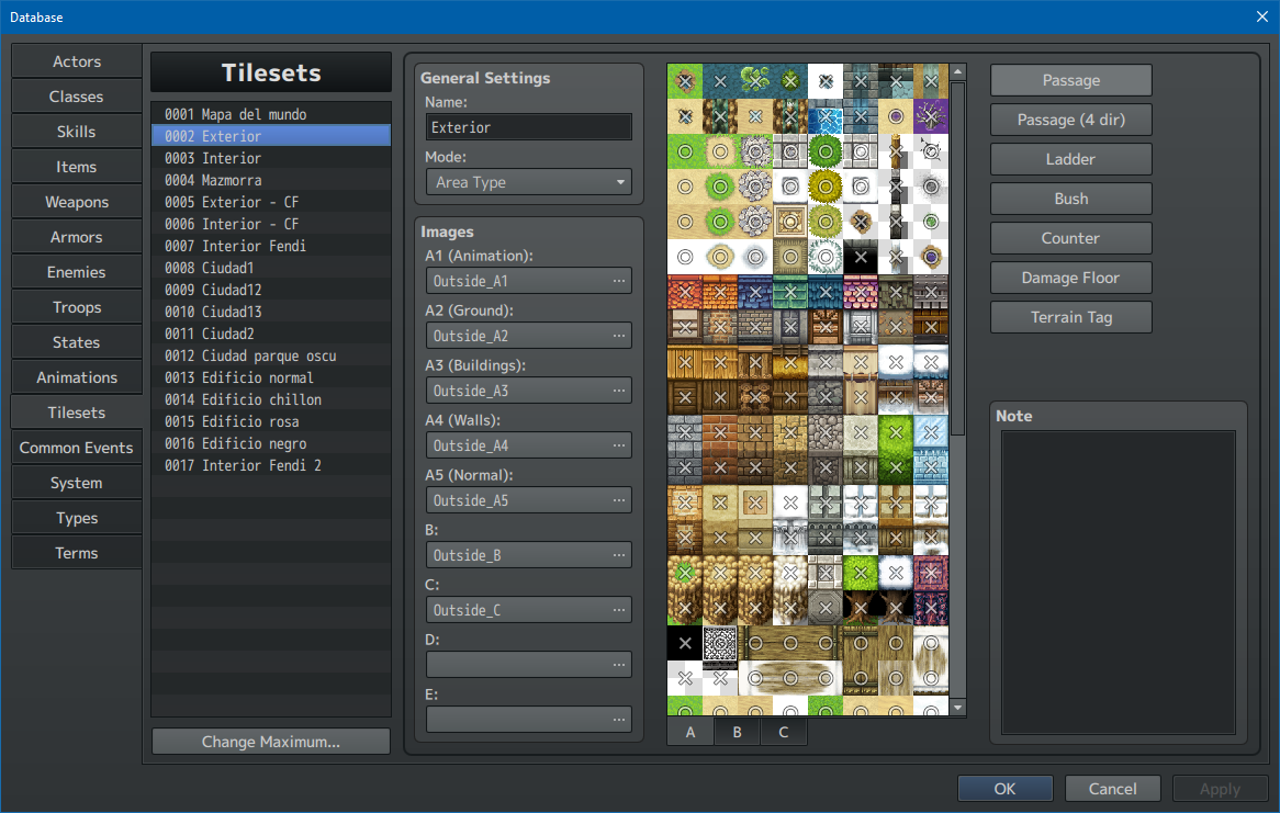
Mode affects how A2 tiles work. Unless you're using RTP (default) assets or assets someone else made, I advise to just select Area Type.
Images is where you select each png image in its place, as every tileset is made up of different tile sheet images. I'll explain these types later. They have to be png, no other format works.
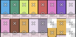
After you add the images, on the right you will see the tiles preview, with some symbols on top of them. If you click on each of these, the symbols will change.
- Circle means your characters can walk on it.
- X means your characters can't walk on it.
- Star means your characters can walk under it.
Tiles in the A tab don't let you use Star. This will make sense later.
By the way, this is the Passage tab. there are also these:
- Passage (4 dir) lets you select from which direction your character can walk on the tile. If you have trouble understanding, I advise testing it for yourself.
- Ladder makes your character able to go down while their sprite is still looking up (as ladders work when you climb).
- Bush makes the character's lower part translucent so it looks like it's standing on a bush or high grass. Honestly this one looks kinda bad, I always ignore it.
- Counter makes it possible to place this tile between an event and the player and still make the event able to be activated by pressing OK like it's next to it. But I think it's easier to make a transparent event where the player will press. It also changes how some A2 tiles look, and it works a little weird, so I'd just avoid it.
- Damage floor does what you imagine it does. As for controlling how much, you probably need a plugin for that, lol, lmao.
- Terrain tag can be used for events and some plugins. Ignore them if you have no use for them.
Tileset characteristics
Tile size is 48x48 pixels.
Tile sheets (the images that contain several tiles) can't be any size you want. They need to be formatted in
a specific way, but before you start formatting you should understand what each part does.
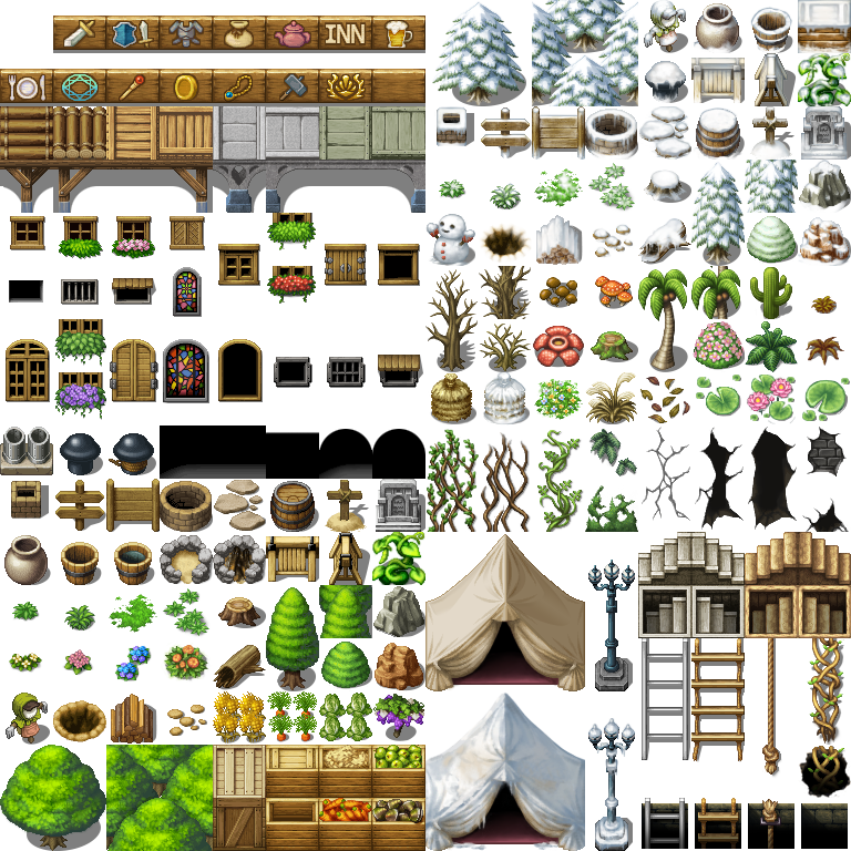
As I showed you before, in Database > Tilesets > Images, you will observe they can have up to 9 images.
- A1: Animation
- A2: Ground
- A3: Buildings
- A4: Walls
- A5: Normal
- B
- C
- D
- E
Every A tile is considered a base tile. This means that there can only be one A tile in a square at a time. If you draw one A tile on top of another A tile, it will replace it (exceptions: some A1 and A2 tiles, more later). This is the reason why they can't have Star passability: there is nothing under an A tile, it's the base.
A1 to A4 are called "autotiles" because they behave differently depending on their surrounding tiles (they are kind of automatic). Unlike the rest, which just draw whatever square you have selected onto your tiles.
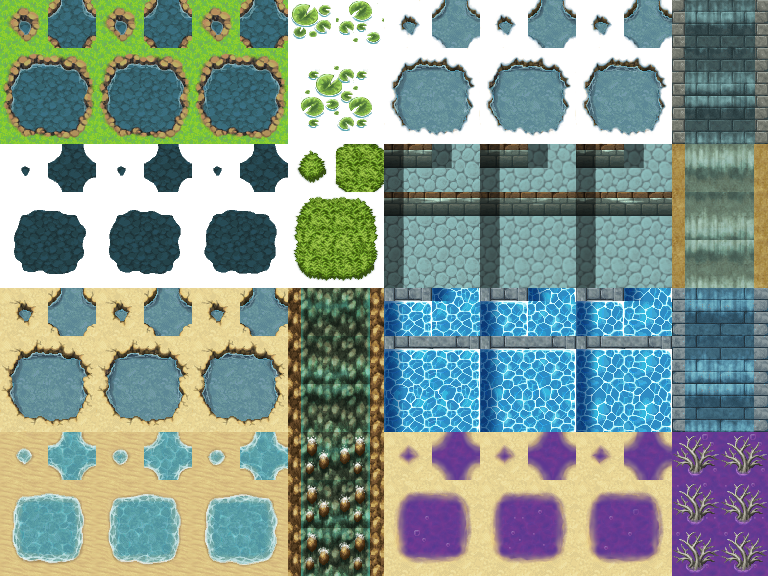
I will be honest. Autotiles are hard to understand and to implement, and they don't even look that good. I ignore most of them and my graphics look fine. Should you ignore them as well? Only you can tell. If you want information on how they work, you could look at the Asset Standards section of the official Help (press F1 with RPG Maker open). Or you could watch this video. It's for VX Ace, but other than the tile size being different, the rest is the same. Yes, it's 30 minutes long. I told you autotiles are hard. It helped me understand them enough to know that I wouldn't bother.
I gave up on most autotiles, but some are easy to set up. I will briefly explain all categories I listed before, one by one. Note that it's not just me, many people ignore A1-A4, so don't feel like you should use them. Only do it if you believe they'll be useful to you.
A1 (animations)
These are the ones I ignore the most. They look repeated because they have 3 frames of animation. Refer to the video I linked to understand how to make these, I'm not able to explain it well.
Also, see the ones with transparency in the background? These are some of the exceptions I mentioned earlier. If you try them in the engine you'll see you can place lotuses on water without water disappearing. However, if you place them outside of water, they will generate water under them, lotus can't go alone.
A1 size is 768 x 576 pixels. For tilesets to work, the images all need to have their specific size.
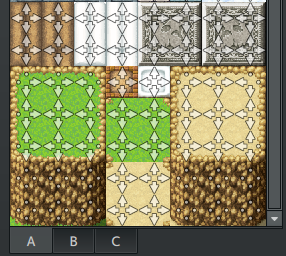
A2 (ground)
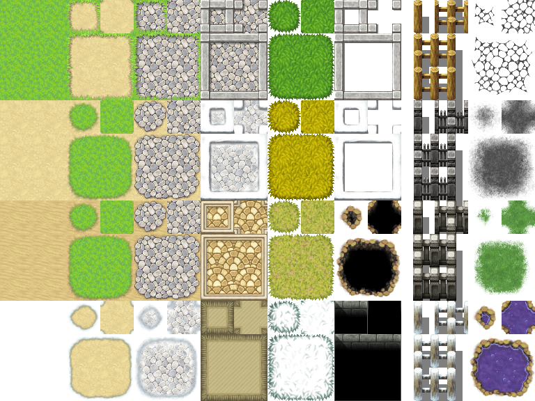
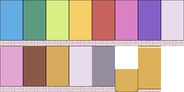
I use these for my project as if they were not autotiles. See how they are divided in blocks that are two tiles wide and three tiles tall? I simply make a regular floor out of them, with no borders. A visual example:
See how they are in the left side while the rest is blank? This is because tile sheets need to have the same size for their type always, as I said before. If you have spare room, just leave it transparent and don't use it.
A2 size is 768 x 576 pixels. Each floor type uses a zone that is two tiles wide and three tiles tall.
By the way, the right half of A2 supports transparency: this means you can place it on top of another A tile and both will be shown at the same time. Use this if you need! You can't place them on top of B-E tiles, though, only on top of another A.
A3 (buildings)
As the name says, these use tiles in a way that will let you make buildings as tall and wide as you want, with roofs as tall and wide as you want. You can store up to 16 types of buildings, 8 above and 8 below.
A3 size is 768 x 384 pixels.
These are used for exteriors in RTP, but you can use them in a different way if you want. For example, I made the lowest tile have a floor (that would look good next to my other floors in A2) and made it passable in the Database. I left the rest of the wall non passable.
As long as I'm careful by only using the lowest tile in the lowest row (so the player can't walk on walls), I can use these autotiles in this way. But you can do whatever you want. As long as you understand how they behave, you can use them to best suit your game.
A4 (walls)
A4 is different from A3 in the sense that the "roof" part behaves like floors in A2, while the wall part behaves the same as A3. I don't use these, so I don't have a clever alternative use, but maybe you can make up yours (or use them as is).
A4 size is 768 x 720 pixels. It can store 24 types of walls, 8 above, 8 in the middle, 8 below.
A5 (normal)
A5 is the most useful of all A tiles, mainly because they don't autotile, so they're easy to use. They can have transparency, but being an A tile (and not one of the exceptions I mentioned earlier), they will replace any other A tile that was under them. Then what is this transparency for? For parallax backgrounds. You select it in the map properties. Whatever tile that was left wholly or partially transparent will let you see this background. If you don't set any background, it will be black.
A5 size is 384 x 768 pixels. It's unfortunate that it is so small, so you have to plan accordingly to your needs. This is why I started using A2 and A3 in the first place, I didn't have enough room in A5.
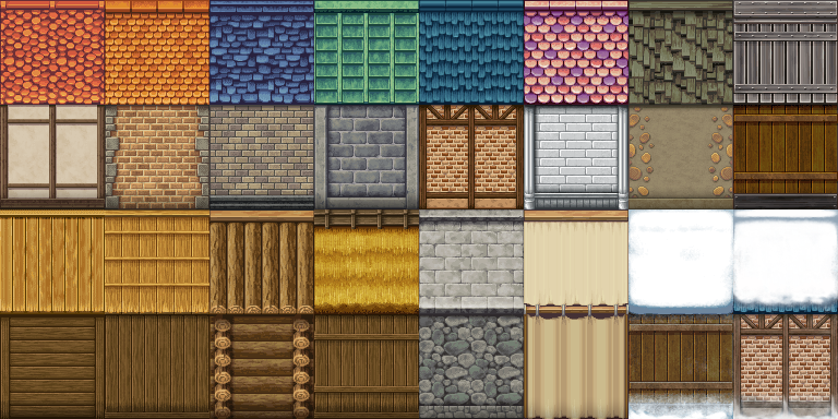
B, C, D, E
B to E work all almost exactly the same. They are the ones that can use transparency on top of other tiles and Star passability. There is a limit on how many you can stack, though. You can use these layers in MV:
- A tile
- B-E tile
- Another B-E tile
That's it, no more layers. If you need an additional layer, you may use events for that. If you need any more, it's not possible without plugins. You should plan your tile sheets accordingly (combining two existing tiles in another space, for example) so you won't need more than these layers.
And by the way, if you ever accidentally add three B-E tiles and see how the first disappears, and you want to fix it, it's always better to erase the tile and start again. It is a little buggy and it may look strange in the playtest (not in the engine).
Fortunately, there is a lot of room in these tile sheets, and you can use up to four images. They are all the same type, the point of having more than one is to give you more room for tiles.
B-E size is 768 x 768 pixels. Note that it is visually divided in half, because the engine will show you the left part above and the right part below. It is advised that you don't place objects in the middle of this division, or it will be more confusing for you to use (they still work though).
B is a little special, you need to keep the uppermost left tile transparent and set it to star in the Database. This will be your eraser tile. C-E don't need this (and, in fact, you shouldn't erase B-E tiles using a transparent tile that isn't the uppermost left B tile). Everything else works the same.
Tip: where to start
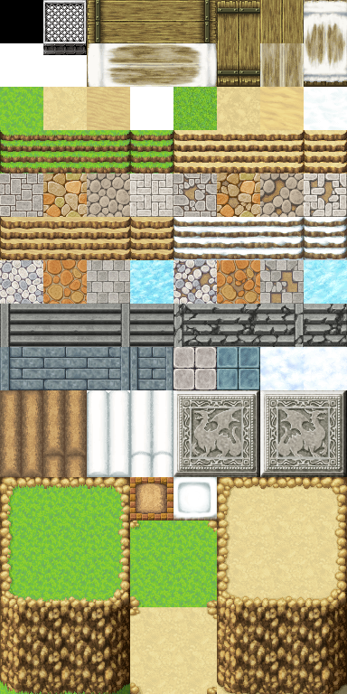
The easiest way to go about it is making a template using an image editor that lets you set custom grids. I can't teach you how to use art programs, but as templates go, you can use mine (open in a new tab to see it bigger).
Here you can see every size of every tile sheet, separated by 48x48 squares. This means that if you set a 48x48 grid in your image editor, you can select each zone easily. Also, B-D are visually divided in two so it's easier to keep that in mind. E isn't there, you copy that one to the side if you need it.
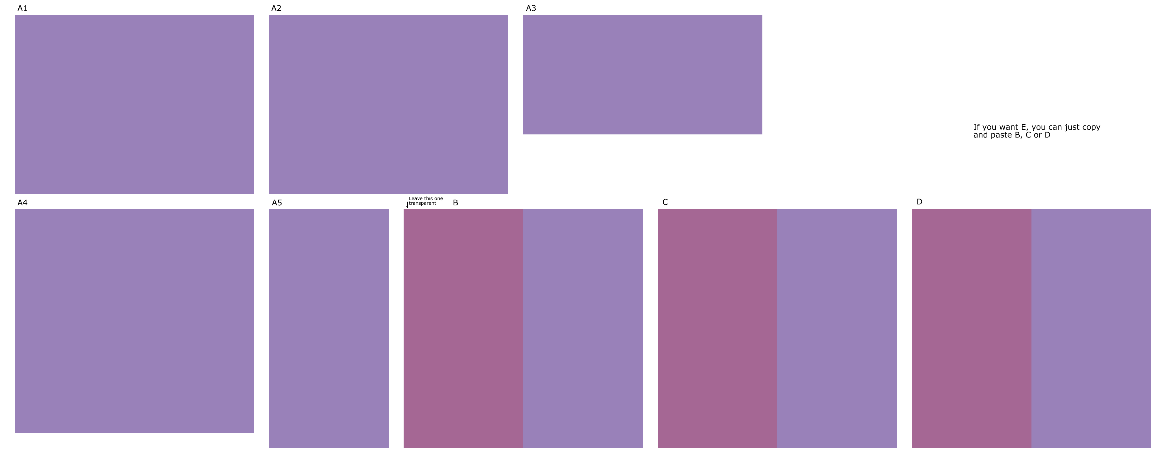
I literally use this background and add layers on top of it to draw my tiles. It helps me to have everything in front of me.
It also helps me to plan my maps before I start drawing anything. I set up a grid, I select a rectangle that is as big as my game window size, and let that be my guide of how much the player can see at any given time. Then I just draw what I want! Even if it's poorly drawn, it helps me to have a reference.
If you didn't know, unless the map is the same size as the window, or the player reaches the map limits, the protagonist will always be centered on the screen.
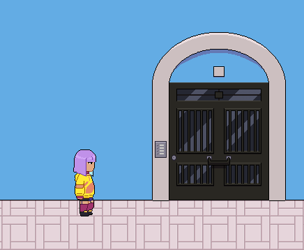
This is the sketch and the finished version of Fendi's room:
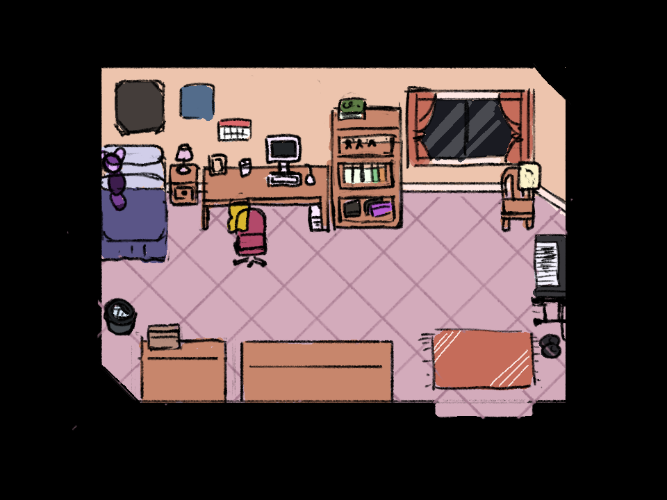
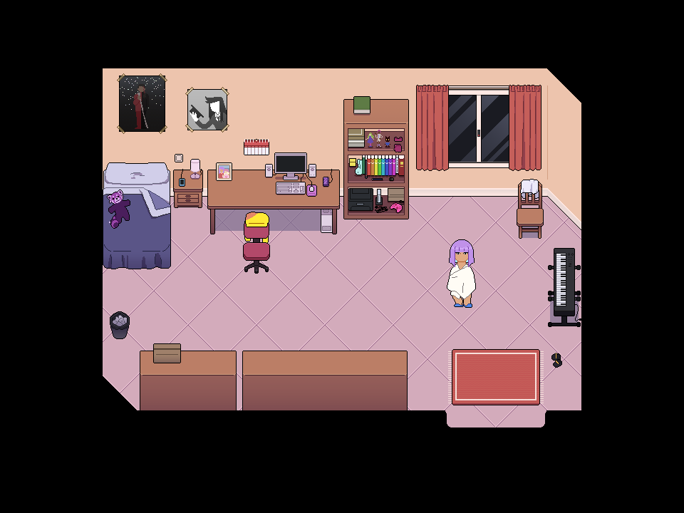
On that note, I advise you to draw your character first. You need to know how big your character is so you can have a reference of how big your world needs to be. Especially if you ignore RTP standards (which many people do, because they don't look great). In my game all characters are taller than one tile, so all the furniture has to follow those proportions.
I often get it wrong when I draw tiles, though, which is why I always have a png of my characters at hand to see them next to my tiles in progress.
Another tip: try your tilesets as you make them. You could simply draw everything and then export it and use it, but as experience has taught me, it's better to export tile sheets even if they're incomplete to check if the different parts look good when put together. And if not, then tweak it, or move it around, and try again.
At least, that helps me stay motivated, rather than believing I have finished and suddenly seeing I have to change lots of things. That said, these mistakes will happen more at the beginning and then they will happen much less frequently. At least that has happened to me.
Tip: avoiding blocky tiles
If you think your tiles are too blocky (and you don't like this because it's not on purpose), there are ways to make the grid less noticeable, at least visually (your characters' movement will make the grid apparent unless you use a plugin to change it).
This can be avoided mostly by moving things around in your tileset, especially B-E. Try to off-center some things, try to overlap things, try to make your objects not start and end right where the grid touches them.
Even if you achieve a non-blocky look this way, it's very possible that, when playtesting, it looks wrong in ways you didn't expect. This is a matter of moving stuff around and decide if you like it more this or that way. Keep your references close, and keep tinkering and trying stuff out.
And well, don't base your tiles too closely on the RTP, because RTP looks blocky already.
Tip: parallax mapping
You may have seen this term around and thought: "If I can just make my map an image and call it a day, why am I gonna bother making tiles?". But this is a noob trap.
Parallax mapping, while possible without plugins, is normally achieved with the help of some. I can't explain more than what it says on the other tutorial, since I don't use this method nor I'm experienced on these plugins.
Also have in mind that they take more space than tiles (and it can be slower to load), since tiles save space everytime you use an element more than once.
You can use parallax mapping if you want! The only thing I don't want you to believe is that it's easier than making tiles, like many people think. It's not. Tilesets are a little hard, parallax mapping is also a little hard, if you already want to be lazy about this I suggest not trying to make your own graphics. If anything, I'd say that making tilesets will give you less headaches.
That said, parallax mapping has its perks. If you're interested, then feel free to investigate and try for yourself. And no one says that a game has to be full parallax mapping or full tiles, you can combine both of these things in any way you want.
And that's it for the tiles tutorial. If I learn something new, I may add it. It's also possible that I made a mistake somewhere, in which case please tell me. But I hope it was helpful. And if you want to thank me... you can always donate, or play my game, which is free.